CHILDREN CANCER CARING CENTER
The 30,000 view
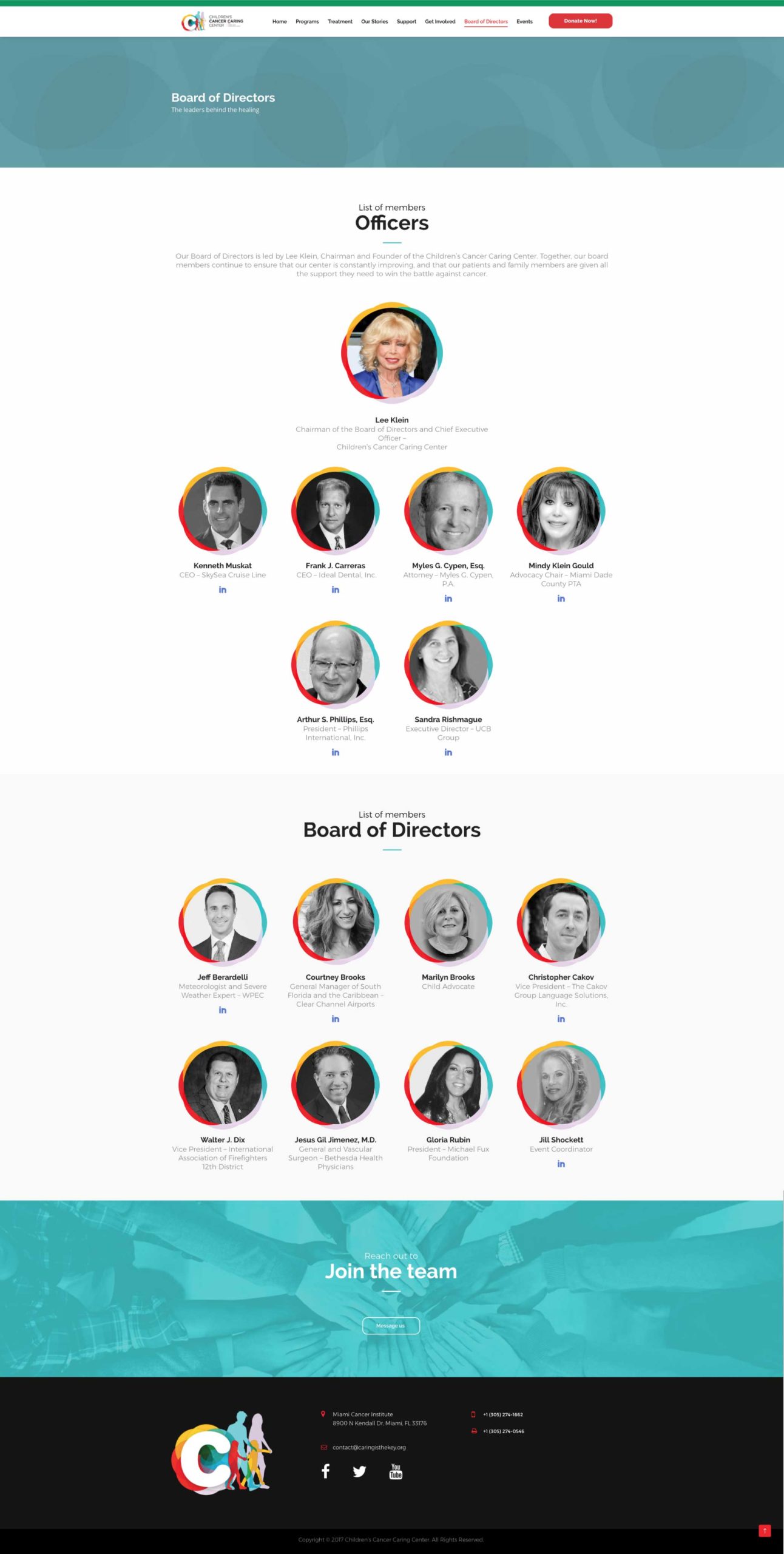
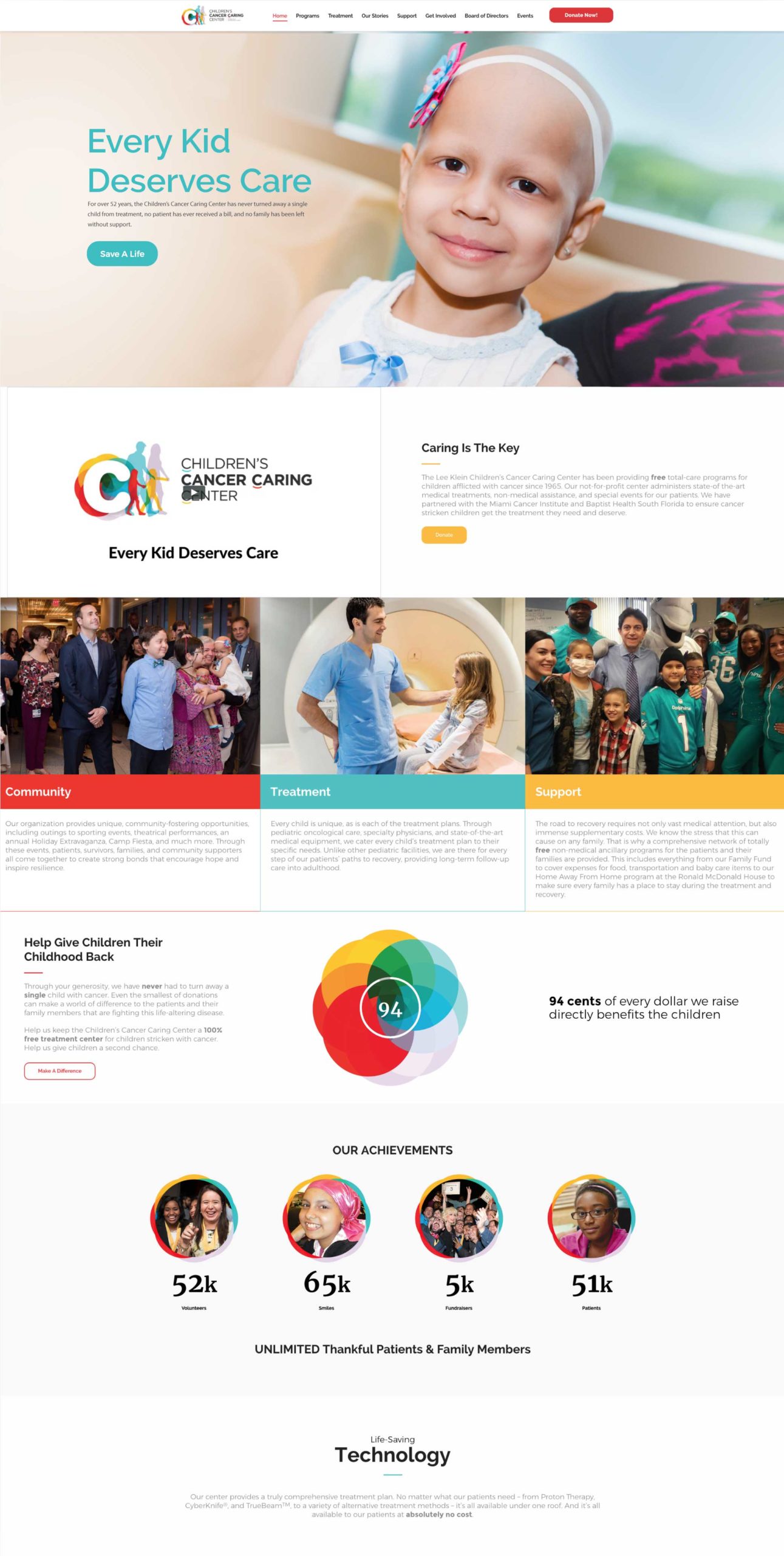
The Children’s Cancer Caring Center (CCCC) has been a beacon of hope for families navigating childhood cancer for over half a century. Offering comprehensive free-of-charge programs ranging from medical treatment to special events, it’s a cause we support proudly. Inspired by the founders’ dedication and moved by families’ resilience, we’ve committed to lending our expertise. Serving as the CCCC’s pro bono partner, we’ve focused on fulfilling their marketing needs. Our journey began with new brand positioning and refreshed design, capturing the essence of the organization— the children themselves. As the CCCC transitions to a new state-of-the-art facility, we’ve embarked on a comprehensive update. From a powerful manifesto to a user-friendly website, we’re dedicated to simplifying support for those in need.
The challenge
As the Children’s Cancer Caring Center (CCCC) prepared to transition into their new state-of-the-art facility at the Miami Cancer Institute, they faced a pivotal moment. It became evident that their existing brand identity and communication strategies needed a refresh to effectively convey the depth of their mission and impact to a wider audience of potential donors, medical professionals, and families affected by childhood cancer.
The challenge lay in articulating the CCCC’s unwavering commitment to providing comprehensive free-of-charge programs while also highlighting their compassionate approach and the transformative difference they make in the lives of children and families battling cancer. In essence, it was time for a brand overhaul that could not only capture the spirit of the CCCC’s mission but also resonate deeply with a broader community of supporters and stakeholders.
The solve
After speaking with the founders of the organization, as well as meeting some of the families they have helped, we were moved to take action ourselves. We’re proud to call the CCCC a pro bono client, as we support all their marketing needs. We started with the creation of a brand positioning and design that reflected just what drives this organization to care – the kids themselves.
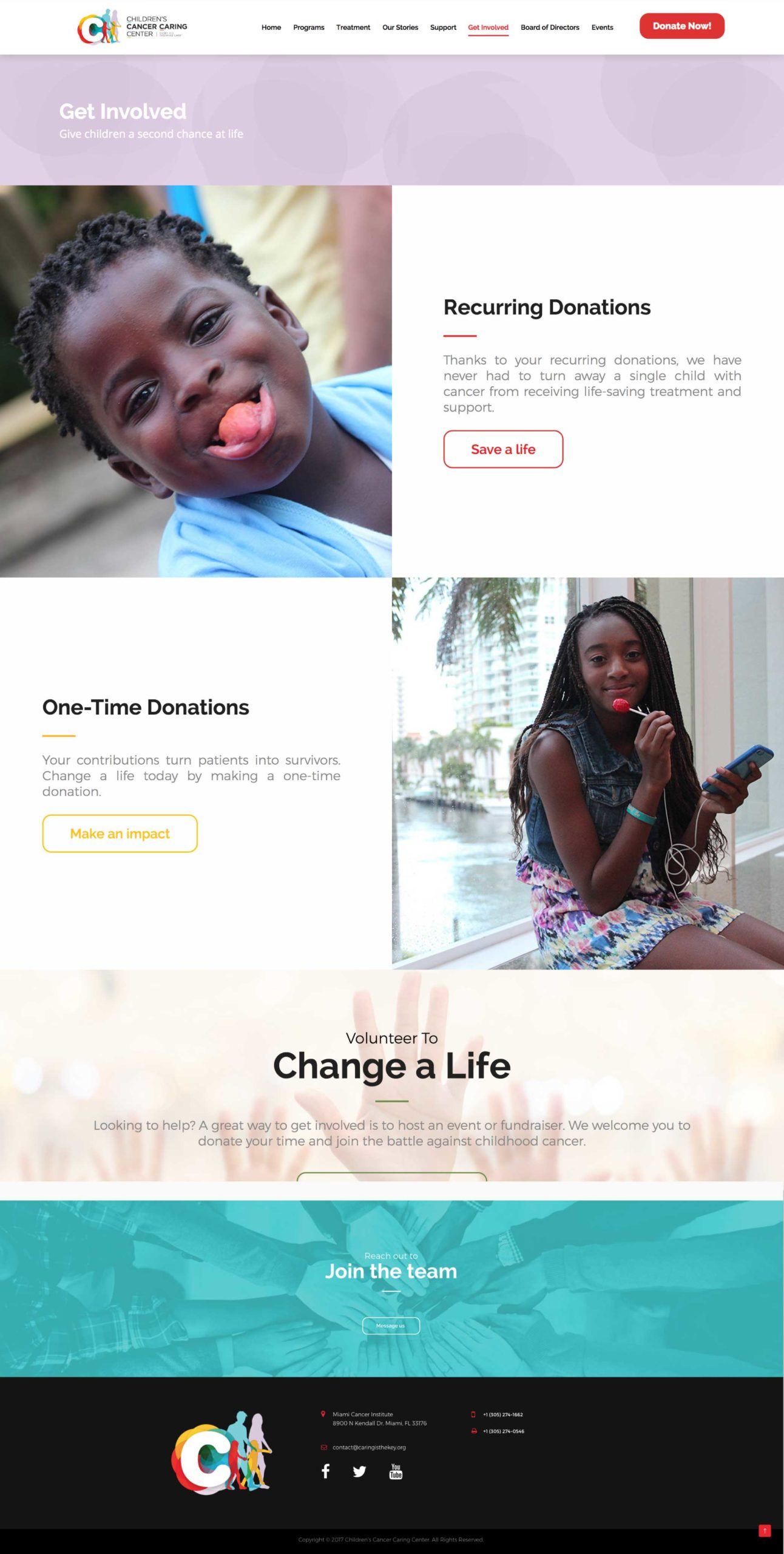
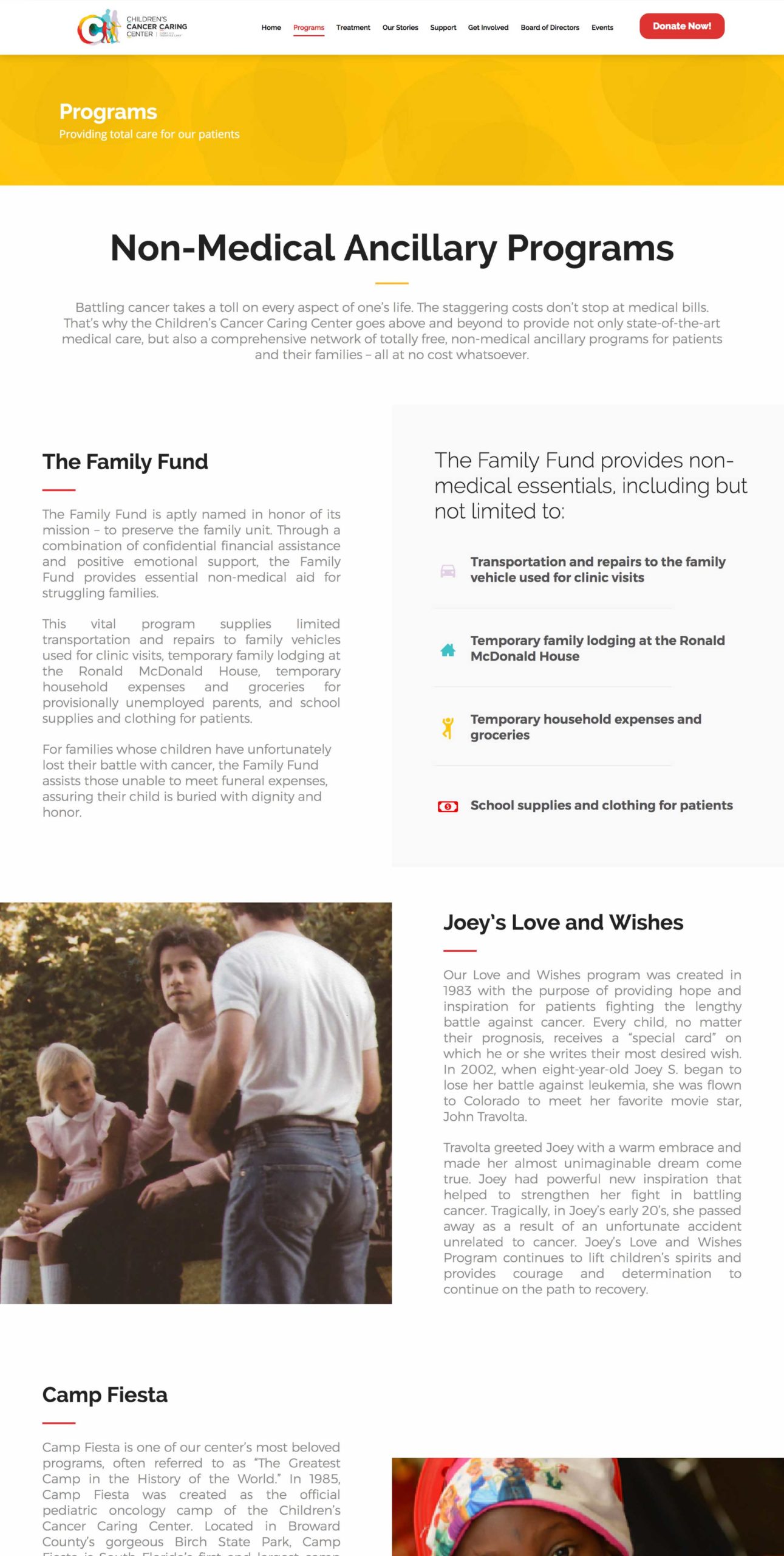
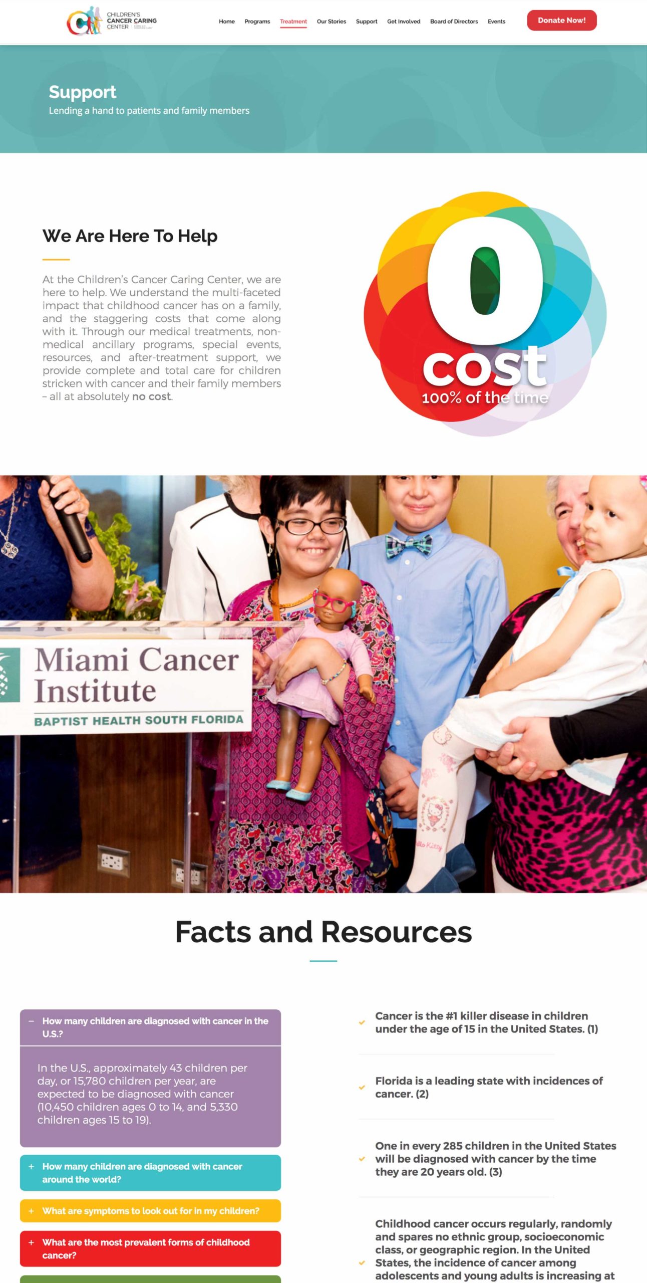
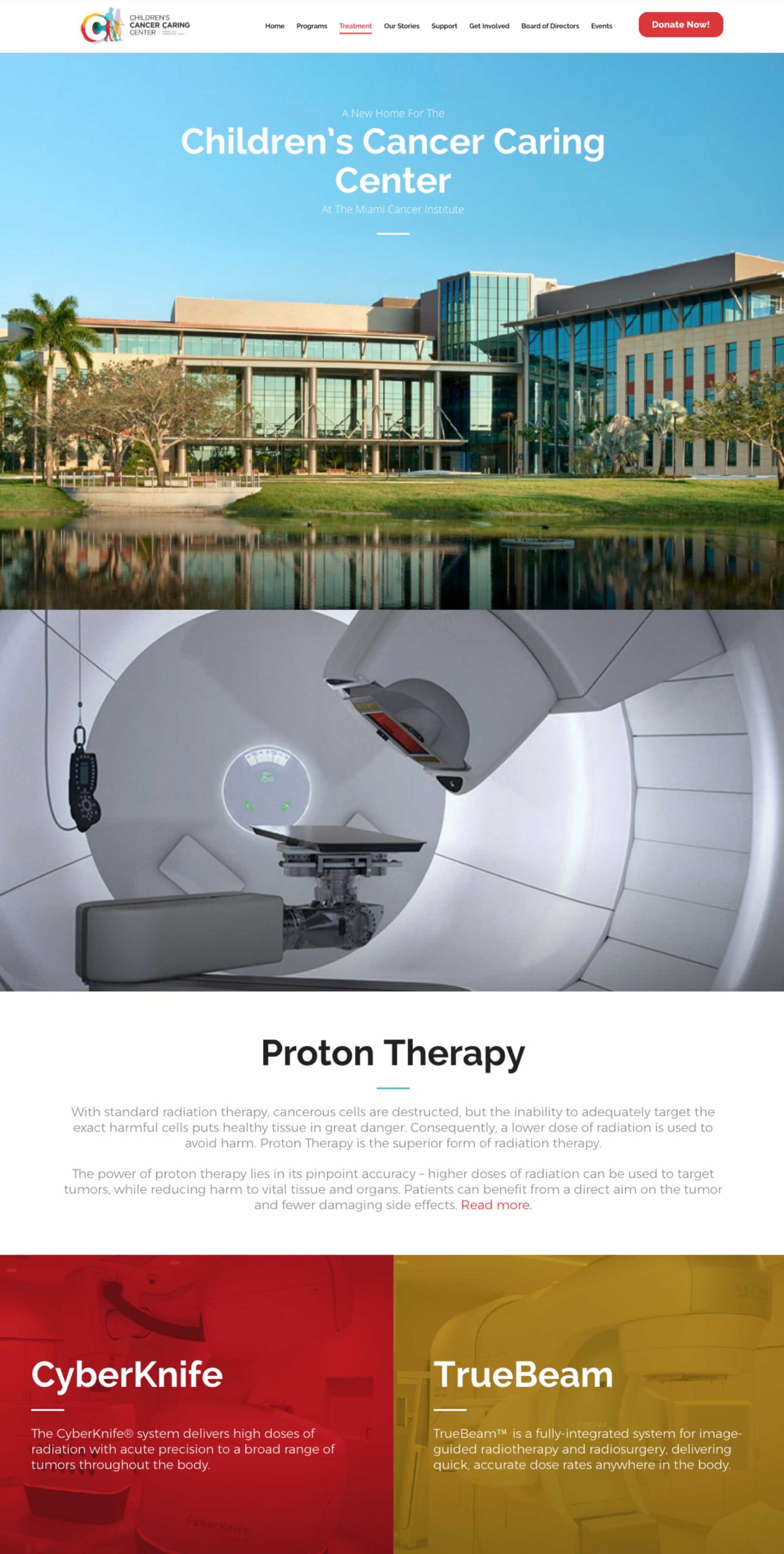
And since they were moving into a new state-of-the-art facility at the Miami Cancer Institute, it was the perfect time to explore an update. We started with a manifesto, video, and logo design, which quickly turned into a website that not only tells the story, but also makes donating as easy as possible.

Logo and tagline refresh
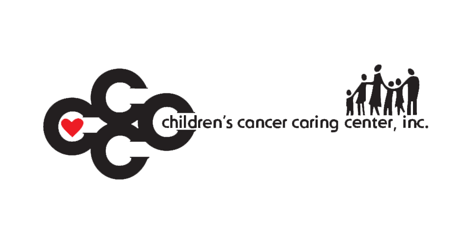
BEFORE & AFTER
With a fresh visual identity and compelling messaging designed to inspire and galvanize, we embarked on a journey to breathe new life into the brand. Opting for warm and inviting colors, we sought to convey more than just the brand—they symbolize hope, resilience, and compassion.
As we embarked on the repositioning of the Children’s Cancer Caring Center, our focus was clear: centering the logo around the children and their healing journey. At the same time, we ensured it encapsulated the modern essence of the new center at the Miami Cancer Institute. The result is a logo that exudes hope and power, while also remaining iconic in its simplicity.


Lavender
is widely used for awareness ribbons and campaigns since it represents all types of cancer and survivors.
Gold
is used to represent childhood cancer in national awareness campaigns and ribbons.
Teal
represents emotional stability, trust, and peace of mind in color psychology.
Red
stands for love, warmth, courage, and passion for helping others.
The results
Our collaboration with the Children’s Cancer Caring Center (CCCC) breathed new life into a fading 50-year-old charity. We revitalized their identity and presence through a comprehensive overhaul of brand identity, online platform, and social media presence. A refreshed logo and tagline infused the new image with hope and compassion. It also aligned with their exciting new transition to the Miami Cancer Institute. The revamped website now offers a user-friendly experience, effectively communicating the organization’s mission and simplifying the donation process. Our strategic social media campaign successfully increased engagement across platforms, inspiring action, and rallying support for the CCCC’s noble cause, ultimately making a profound difference in the lives of children and families affected by cancer.
